Tuesday, 22 April 2014
Welcome Post
Dear Moderator,
I have completed all the tasks in this process myself including my preliminary task (a swede movie trailer) as well as my horror movie trailer. I have completed these using iMovie and I have completed my evaluation using both iMovie and Prezi. In my blog I have included the different things which I have used to help me throughout this process. Thank you for taking the time to evaluate my work.
From Remi Martinelli
Candidate Number: 9122

Saturday, 29 March 2014

Friday, 28 March 2014
Thursday, 27 March 2014
Wednesday, 26 March 2014
Monday, 10 March 2014
Tuesday, 4 March 2014
Evaluation questions
EVALUATION
- Provide one presentation of your evaluation.
- There are 4 questions to answer - discuss all aspects of your production.
- Use various forms of media.
- In what ways does your media product use, develop or challenge forms and conventions of real media products? (teaser trailers, posters, magazines)
- How effective is the combination of your main product and ancillary tasks?
- What have you learned from your audience feedback?
- How did you use new media technologies in the construction and research, planning and evaluation stages?
Saturday, 22 February 2014
Poster analysis
In my last post, you can see the changes I have made to my poster in order to make it look more professional. I looked on Google images at pictures of offical movie posters in order to get more of an idea of exactly how they should look.
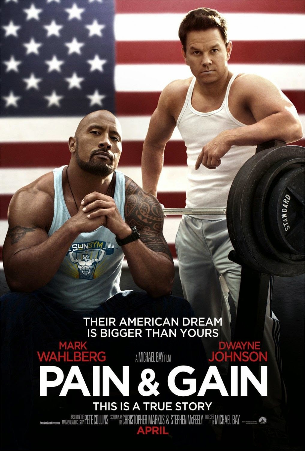
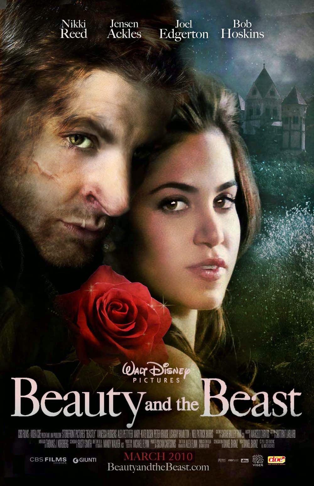 I've already researched into horror movie posters, like the Saw posters so I wasn't looking specifically to focus just on horror posters to create my own. I realised that, other than the central picture, the actual layout of movie posters were all the same so I looked at these two posters for ideas.
 Like the Beauty and the Beast poster, I put the names of the actors of my film at the top so that they stood out against the background, making the audience notice/recognise their names immediately.
Like the Pain&Gain poster, I decided to follow their layout of the screenplay and director information (seen below). I put the parts that I felt were important in bold font - like the name of the film, the names of Lois and me and the film company name.
I also liked that this poster put the month of the release date in bold capitals, in a bright font so the audience knew immediately when they would be able to see the film. I did the same on my poster, putting the font in red to stand out on the black and white of my poster.

Thursday, 20 February 2014
Poster

I wanted the death symbol which is on the hand on my poster to be in red so that it stood out against the black and white of the entire background. I searched on Google for tutorials to show me how to just get one part of the image to be in colour but they were really difficult to understand. It was proving time consuming to try and change this tiny detail of my poster, so I decided to just leave it as it was because I knew it was unrealistic to try to make that change.
Sunday, 16 February 2014

Friday, 14 February 2014
Making changes to the poster
After my teacher looked at my poster, she advised me on how I could change it to make it look more effective and to make the genre more prominent. In order to do this, I changed the placing of the actors names to the top of the poster as opposed to at the bottom as I felt that the top of the poster was more likely to be looked at than the bottom.
The most obvious change I have made is making the poster black and white, highlighting the red of the fonts. I decided to do this because red is the colour most associated with horror and by making this the protrusive feature on the poster, the audience are more aware of the genre created. The black and white allows a sense of mystery to what the film is about.
Thursday, 13 February 2014

Wednesday, 12 February 2014
Decisions
Instead of carrying on with my DVD cover, I decided that I wanted to focus on my poster instead. Although I would have liked to have finished my DVD cover first, time is proving difficult so I would rather get my poster completed to a standard that I want. Also, the back page of the DVD cover has been proving difficult for me because I don't know how to make the picture the same colour as the front page, although I have tried various different things to change it. If I have more time, I will attempt to complete my DVD cover.
Monday, 10 February 2014
The Ouija Deal - Bloopers
I have put together some of the unused clips from the day we filmed for our trailer, using iMovie.
Friday, 7 February 2014


Thursday, 6 February 2014
Starting my DVD cover using photoshop

Here is the beginning of my DVD cover using PhotoShop. As you can see, I have used the image of my hand with the death symbol on the hand in blood (there is a shot of this within our movie trailer which is why I chose to include this). I have tried to make my DVD cover as realistic and similar to other DVD products as possible.
Wednesday, 5 February 2014
Photos for DVD cover
I created the death symbol on the hand by using red and brown acrylic paint mixed together, to look like blood. I have chosen the second photo to use for my DVD cover.


Subscribe to:
Posts (Atom)