In my last post, you can see the changes I have made to my poster in order to make it look more professional. I looked on Google images at pictures of offical movie posters in order to get more of an idea of exactly how they should look.

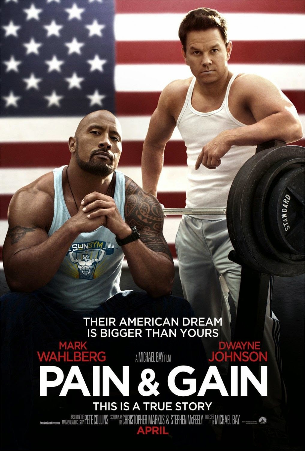
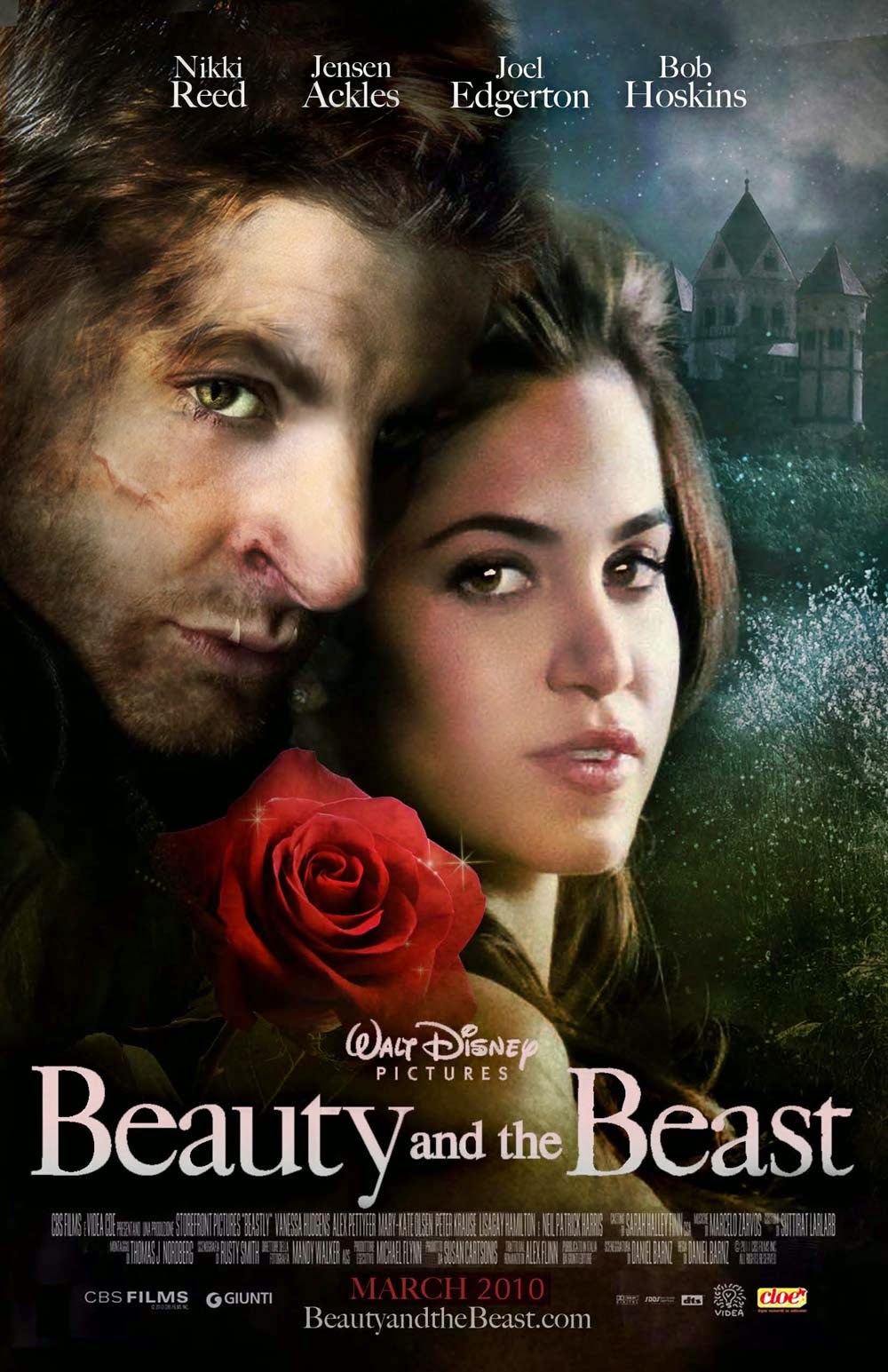
 I've already researched into horror movie posters, like the Saw posters so I wasn't looking specifically to focus just on horror posters to create my own. I realised that, other than the central picture, the actual layout of movie posters were all the same so I looked at these two posters for ideas.
 Like the Beauty and the Beast poster, I put the names of the actors of my film at the top so that they stood out against the background, making the audience notice/recognise their names immediately.
Like the Pain&Gain poster, I decided to follow their layout of the screenplay and director information (seen below). I put the parts that I felt were important in bold font - like the name of the film, the names of Lois and me and the film company name.
I also liked that this poster put the month of the release date in bold capitals, in a bright font so the audience knew immediately when they would be able to see the film. I did the same on my poster, putting the font in red to stand out on the black and white of my poster.

No comments:
Post a Comment