Tuesday, 22 April 2014
Welcome Post
Dear Moderator,
I have completed all the tasks in this process myself including my preliminary task (a swede movie trailer) as well as my horror movie trailer. I have completed these using iMovie and I have completed my evaluation using both iMovie and Prezi. In my blog I have included the different things which I have used to help me throughout this process. Thank you for taking the time to evaluate my work.
From Remi Martinelli
Candidate Number: 9122
Saturday, 29 March 2014

Friday, 28 March 2014
Thursday, 27 March 2014
Wednesday, 26 March 2014
Monday, 10 March 2014
Tuesday, 4 March 2014
Evaluation questions
EVALUATION
- Provide one presentation of your evaluation.
- There are 4 questions to answer - discuss all aspects of your production.
- Use various forms of media.
- In what ways does your media product use, develop or challenge forms and conventions of real media products? (teaser trailers, posters, magazines)
- How effective is the combination of your main product and ancillary tasks?
- What have you learned from your audience feedback?
- How did you use new media technologies in the construction and research, planning and evaluation stages?
Saturday, 22 February 2014
Poster analysis
In my last post, you can see the changes I have made to my poster in order to make it look more professional. I looked on Google images at pictures of offical movie posters in order to get more of an idea of exactly how they should look.
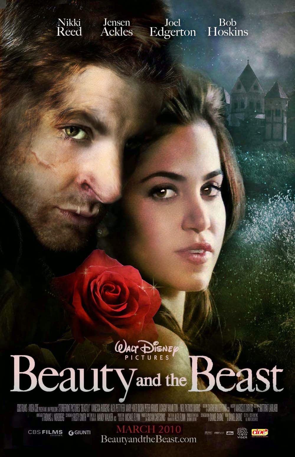 I've already researched into horror movie posters, like the Saw posters so I wasn't looking specifically to focus just on horror posters to create my own. I realised that, other than the central picture, the actual layout of movie posters were all the same so I looked at these two posters for ideas.
 Like the Beauty and the Beast poster, I put the names of the actors of my film at the top so that they stood out against the background, making the audience notice/recognise their names immediately.
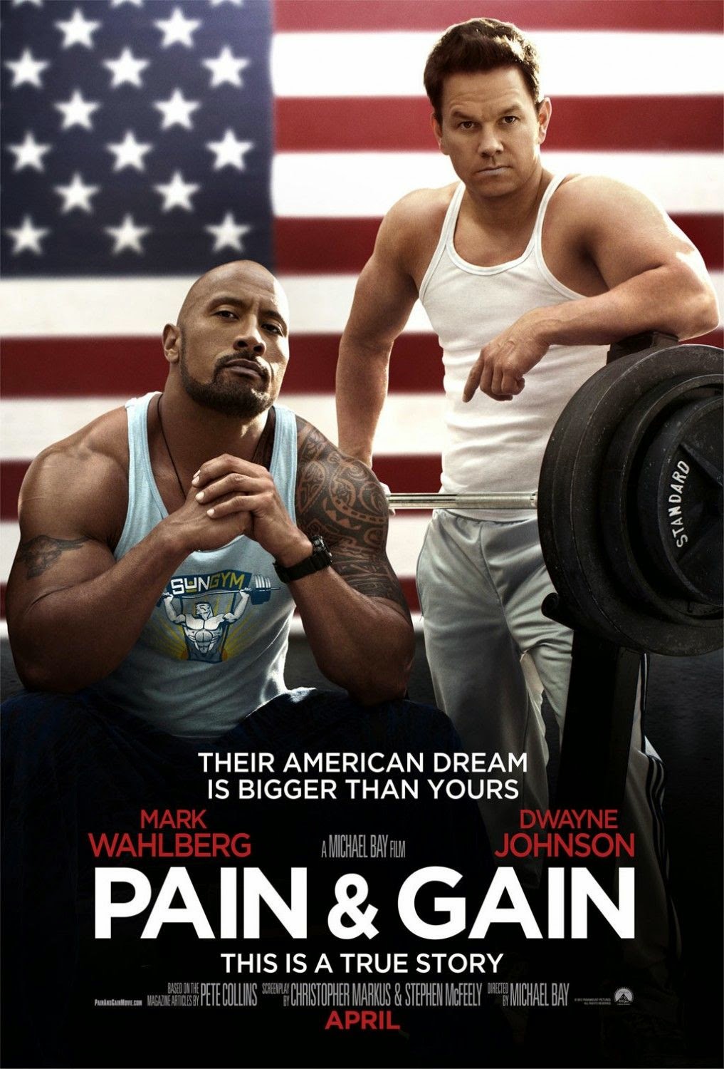
Like the Pain&Gain poster, I decided to follow their layout of the screenplay and director information (seen below). I put the parts that I felt were important in bold font - like the name of the film, the names of Lois and me and the film company name.
I also liked that this poster put the month of the release date in bold capitals, in a bright font so the audience knew immediately when they would be able to see the film. I did the same on my poster, putting the font in red to stand out on the black and white of my poster.

Thursday, 20 February 2014
Poster

I wanted the death symbol which is on the hand on my poster to be in red so that it stood out against the black and white of the entire background. I searched on Google for tutorials to show me how to just get one part of the image to be in colour but they were really difficult to understand. It was proving time consuming to try and change this tiny detail of my poster, so I decided to just leave it as it was because I knew it was unrealistic to try to make that change.
Sunday, 16 February 2014

Friday, 14 February 2014
Making changes to the poster
After my teacher looked at my poster, she advised me on how I could change it to make it look more effective and to make the genre more prominent. In order to do this, I changed the placing of the actors names to the top of the poster as opposed to at the bottom as I felt that the top of the poster was more likely to be looked at than the bottom.
The most obvious change I have made is making the poster black and white, highlighting the red of the fonts. I decided to do this because red is the colour most associated with horror and by making this the protrusive feature on the poster, the audience are more aware of the genre created. The black and white allows a sense of mystery to what the film is about.
Thursday, 13 February 2014

Wednesday, 12 February 2014
Decisions
Instead of carrying on with my DVD cover, I decided that I wanted to focus on my poster instead. Although I would have liked to have finished my DVD cover first, time is proving difficult so I would rather get my poster completed to a standard that I want. Also, the back page of the DVD cover has been proving difficult for me because I don't know how to make the picture the same colour as the front page, although I have tried various different things to change it. If I have more time, I will attempt to complete my DVD cover.
Monday, 10 February 2014
The Ouija Deal - Bloopers
I have put together some of the unused clips from the day we filmed for our trailer, using iMovie.
Friday, 7 February 2014

Thursday, 6 February 2014
Starting my DVD cover using photoshop

Here is the beginning of my DVD cover using PhotoShop. As you can see, I have used the image of my hand with the death symbol on the hand in blood (there is a shot of this within our movie trailer which is why I chose to include this). I have tried to make my DVD cover as realistic and similar to other DVD products as possible.
Wednesday, 5 February 2014
Photos for DVD cover
I created the death symbol on the hand by using red and brown acrylic paint mixed together, to look like blood. I have chosen the second photo to use for my DVD cover.


Tuesday, 4 February 2014
My Website completed


Lois' Website


This is the main layout of Lois' website. There is the gallery page which includes the Cast List page and the Photos from the shoot. There is then the About Page and the Booking Page. In the third print screen, 'The Ouija Deal' is usually in a different font but the computer I am using does not display it as it should be shown. Lois has stuck to the red, white and black colour theme which we decided on.
Wednesday, 15 January 2014
Information we have chosen to include on website
HOME PAGE
On the home page, we want to include the name of the movie 'The Ouija Deal' in bold at the top so it is instantly visible and stands out to the audience of the website. The home page will only include the trailer because we want the audience to explore the website to find out more rather than find all the information on the one page.
GALLERY - CAST LIST
We decided we wanted the cast list page separated from any other page containing photos of the film. The reason for this is because we want the audience to know who the actors are and to learn a bit of background information on their lives outside of acting. This will not only help them to be more interested in the characters but also the entire film, too.
GALLERY - PHOTOS FROM FILMING
We want to include a slideshow of all the photos from the day of filming. This will help the audience to see some of the 'behind the scenes' of the day we filmed for the trailer. This will include: getting make up done, the filming of scenes, close up of make up.
ABOUT PAGE
The about page will include an explanation on what the film is about and who it is created by. This will help the audience to understand the meaning behind the story of the film and exactly what the film will be about. This will hopefully entice the audience to watch the film.
BOOKING PAGE
On this page, we will include all booking information. This means we will list the cinemas that our film will be shown in, links to the cinema websites to make it easily accessible for the audience to make their booking, links to our Facebook, Twitter and YouTube pages and also contact information for Sombre Productions if people want to get in touch.
Tuesday, 14 January 2014
Pictures of cast chosen for websites


These are the photos we decided to use on the 'cast list' page for our website. We wanted close up photos of each of the actors so that their image was clear to the audience. Ideally, we would have liked to have taken 'professional' photos or photos that looked professional, like Lizzie's at the bottom right. The only reason we would have liked to have done this is because it would look genuine and realistic on the website overall.
Monday, 13 January 2014

Saturday, 11 January 2014

Monday, 6 January 2014
Reviewing each group's work
Today each group in our class put their video up for every other group to see. By doing this, it enabled us to give feedback and helpful advice on how they could perhaps improve their music videos/film trailers.
This method of peer marking was particularly useful because it enabled us to see things that could be changed in others' videos and we could then apply this to our own work.
Saturday, 4 January 2014
Use of transitions
CROSS DISSOLVE


Friday, 3 January 2014
Continuity Editing
CONTINUITY EDITING


The three clips shown here are another example of continuity editing which we have included. The shot of Lois coming up the stairs continues until she gets to the door to open it. The next shot is then filmed from inside the room as Lois opens the door and comes inside. I think the shot works really well because it shows both Lois getting to the location and then the audience can see where exactly the location is.
Editing

To keep to the conventions of the setting of a horror movie being a dark, eery place, we wanted to edit the clip above so that it was not too vibrant. When watching through what we have put together so far, the brightness of this scene just did not fit in at all with the genre.

As a result of this, we decided to edit the clip by changing the exposure and brightness. To do this, we clicked 'video adjustments' and used the sliding bars to decide how dark we wanted our clip to be. By changing the brightness to -38%, it instantly made the clip appear as though it was filmed during a darker time, as opposed to when it was filmed in the daylight.
Thursday, 2 January 2014
Editing Process

In order to create a continuity of a shot within the editing process in iMovie, we used the crop tool to do this. What we had to do was keep adding the same shot in but cropping it each time so that it looked like we had zoomed in on my face using the camera although we didn't. The reason we didn't use the camera to do this was because it was difficult for Lois to steady the shot so we used the crop tool instead. Below are the print screens of the shot each time it moves closer towards the camera.


Subscribe to:
Posts (Atom)